Game Name: P.U.P.P.I.T.
Year: 2021-2022
Programming Language: C++
Roles: Art Lead, Character Designer, VFX/UI Designer
Duration: ~35 weeks
Year: 2021-2022
Programming Language: C++
Roles: Art Lead, Character Designer, VFX/UI Designer
Duration: ~35 weeks
|
|
Since I had no experience modeling or animating in Maya, I knew that the enemy designs had to be kept simple. So when designing the enemies, I took inspiration from older toys. since their designs were simpler compared to modern toys.
When designing the enemies, I decided to base one of them on a wind-up toy duck. To keep with the nightmarish toy aesthetic our game was trying to emulate, I kept the duck's color a dark blue. I added crossed eyebrows to the duck mesh and made the duck's eyes red after receiving feedback from professors that the duck didn't look threatening. All of the animations were done in Maya. Then they were broken up once I exported the duck into Unreal. It was important to have a signifier for when the duck was about to attack. So I had its wings move upwards. That allowed the duck's silhouette to change, which allows the user to recognize at a glance that the duck is about to attack. |
|
|
For the flying enemy, I came up with a design that was based on a toy plane. Since the enemy was going to be above the player, it was important to make the airplane large. That way, the player would have an easier time shooting it.
|
|
|
I based the design of the ranged enemy on a toy soldier. Like the duck enemy, all of the soldier's animations were done in Maya, and then they were broken up once exported to Unreal.
Originally, the enemy's bullet was a small sphere. However, I changed that to a larger disk so that the player would have an easier time spotting it. In order to keep its style consistent with the other enemies, the soldier's color scheme is a darker purple. |
|
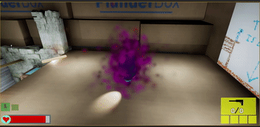
During the last few weeks before the game project was due, myself and another teammate used the Unreal's particle system to enhance the enemies and the game's aesthetics. In the example shown, I added particles to our destructible duck spawners so they looked more menacingly. To get the effect of red particles appearing, I made their distance farther away from the spawner. That way, when the player destroys the spawner, the red particles would disappear. Since our game was about defeating the child's nightmares, having the red particles disappear when the spawner is destroyed makes it feel like the player is cleansing the world. I would also take a look at the particle effects my teammate implemented and would update them based on feedback from playtesters. That would free up my teammate so they could work on fixing bugs.
|
|
|
For the menus, I used a crayon texture to make it feel like these were things a child could draw. When coming up with the menu designs, the narrative designer came up with story beats he'd like to see in the menus. For instance, on the victory screen, he wanted the cat and puppet to be friends again. So I took his ideas and came up with different backgrounds for the menus. Then, both he and an art TA would give me feedback. I would then iterate the menu designs based on their feedback.
|
